 Holly Holderman of LakeHouse Dry Goods joins us again today to start a two-part post about her newest boy-and-girl lines, Boy Oh Boy and Little Lady. Boy Oh Boy has got all the prints a little boy (or a mother of a little boy!) could desire, from frogs to teddy bears to sailboats. The colors are reminiscent of the LakeHouse touch--deep saturated purples, blues, and moss greens. But we'll let Holly, the blogger extraordinaire, fill you in. Next week, we'll finish up with her thoughts on Little Lady!
Hello again everyone,
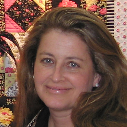 I'm excited to be invited back again as a guest blogger for the Jolly Jabber.
This time I thought it would be fun to share a bit of the process I go through to develop a new grouping of textiles...The days of when I had the time to actually produce all of my own artwork & designs are long gone now, but my process is still filled with creativity, color & lots of surprises.
For the BOY OH BOY collection, I actually purchased several pieces of artwork at Surtex, a surface design trade show in New York City last year. I used to exhibit as a licensing / design studio under the name LakeHouse at that show back in the early 1990s. That was before I started LakeHouse Dry Goods, my textile company devoted to selling designs on fabric for independent quilt shops.
In the case of the BOY OH BOY design, it is an mixture of several pieces of artwork. Experience told me it was going to be a labor of love to translate the original artwork into a nice looking textile design, but it had so much potential! To begin with, the artwork had oodles of textures and shading, which in the textile world means that I'd need LOTS & LOTS of screens. Our limit is 18 screens where we print overseas. It needed a lot of “head room”... So I put it up on the design wall in the studio to think about.
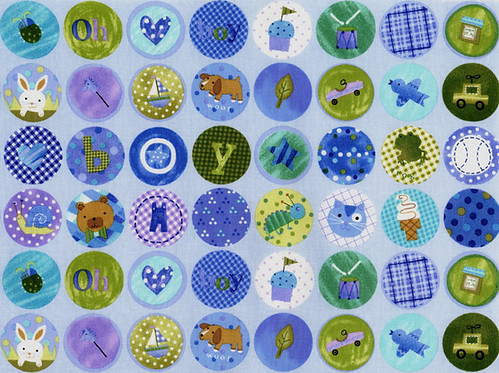 Here's a look at my finished design BOY OH BOY up close...the entire BOB collection can be seen on my website; just click on the miniature salesman card and that will take you to the swatch pages.
Next I had to edit the motifs in the original artwork, re-assign some of the color positions, for color balance and get the design into a repeat that worked for quilters and home sewers. One of the things I did was to size the circles a little less than 1-1/2” in diameter so that it would be easy to fussy cut in 1-1/2” increments (3, 4-1/2 & 6” square finished blocks).
 Also, I decided that the BOB design needed to be for a wider age range than for just a "baby boy." Instead, I chose a "baby - toddler - young boy" time frame, so the motifs had to be appropriate for this range of ages. You can see the difference with the original artwork at the left:
For the finished collection of designs, I also developed a color palette that worked for this grouping and still "played well" with one of the existing color palettes that we are currently working with... It’s more work this way, but I do it so that season after season our fabrics will go well with each other, for the quilter as well as the quilt shop owner.
To maximize the appeal of the designs, I also took out motifs that were a little too unusual to be recognized, or anything else that I thought needed improvement. Notice the "woof" dog in the original artwork, it looked more like a wolf to me than a dog...So I put a new dog in that was more friendly looking in it’s place.
 After the circle inspired “BOY OH BOY” main pattern was finished, I made virtually all of the BOB smaller tossed coordinates out of the motifs from this pattern. I also developed some quieter & simpler dots, textures, and stripes to round out the collection, including several existing patterns from our LakeHouse Library (our library consists of the non specific prints that can mix into many different collections, by color).
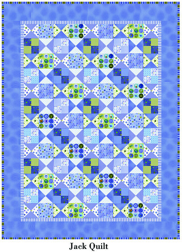
Here's a picture of my "Jack" version from my Jack & Jill quilt pattern that we introduced at Spring Market. It’s an easy-to-make quilt with a few blocks of beginner-level fussy cutting. You can see this and more quilts that I designed for Spring Quilt Market on my blog: HollyHolderman.typepad.com. More information about my quilt patterns is also on “Tote Bag Queen” Penny Sturges’s quiltsillustrated.com website.  Most of you know by now that Penny is writing and publishing my patterns... This is a blessing to me, since people love her writing style (she makes patterns easy to understand!), and there just aren’t enough hours in my day anymore to write & publish patterns, in addition to everything else.
I’ll be back soon on the Jolly Jabber with more info about our Spring Market offerings.
;) H2
Holly BlogLabels: Guest Quilting Writers
 Holly Holderman of LakeHouse Dry Goods joins us again today to start a two-part post about her newest boy-and-girl lines, Boy Oh Boy and Little Lady. Boy Oh Boy has got all the prints a little boy (or a mother of a little boy!) could desire, from frogs to teddy bears to s
 I'm excited to be invited back again as a guest blogger for the Jolly Jabber.
 Here's a look at my finished design BOY OH BOY up close...the entire BOB collection can be seen on my website; just click on the miniature salesman card and that will take you to the swatch pages.
 Also, I decided that the BOB design needed to be for a wider age range than for just a "baby boy."
  After the circle inspired “BOY OH BOY” main pattern was finished, I made virtually all of the BOB smaller tossed coordinates out of the motifs from this pattern. I also developed some quieter & simpler dots, textures, and stripes to round out the collection, including several existing patterns from our LakeHouse Library (our library consists of the non specific prints that can mix into many different collections, by color).
 Most of you know by now that Penny is writing and publishing my patterns... This is a blessing to me, since people love her writing style (she makes patterns easy to understand!), and there just aren’t enough hours in my day anymore to write & publish patterns, in addition to everything else.